A Design System That Cut Development Time and Improved Consistency
Working closely with engineers, I ensured a consistent user experience, streamlined workflows and built confidence across CultureAI’s ecosystem by building a comprehensive design system from scratch. One that contained scalable patterns, documentation and tailwind based tokenisation.
Challenge
As the platform matured, so did the complexity.
Styles were duplicated. Components weren't reused.
Engineers rebuilt UI from scratch, often with guesses and gaps.
What we lacked was a shared visual language; a scalable system that made good design the default, not a dependency. My goal was to replace chaos with clarity, without adding process overhead.
Approach
ALIGNING WITH DEVELOPERS
Instead of beginning with a master UI kit, I started with how our engineers actually built things.
I worked directly with them to define a token architecture based on Tailwind, focusing on:
Spacing, radius, colour, and type scales
Reusable tokens for global consistency
Semantic naming that made components intuitive to use, even when no designer was in the room
For example: icon-to-text had a tailwind value of 2 (0.5rem) and could be applied everywhere an icon with accompanying text appeared in the platform.
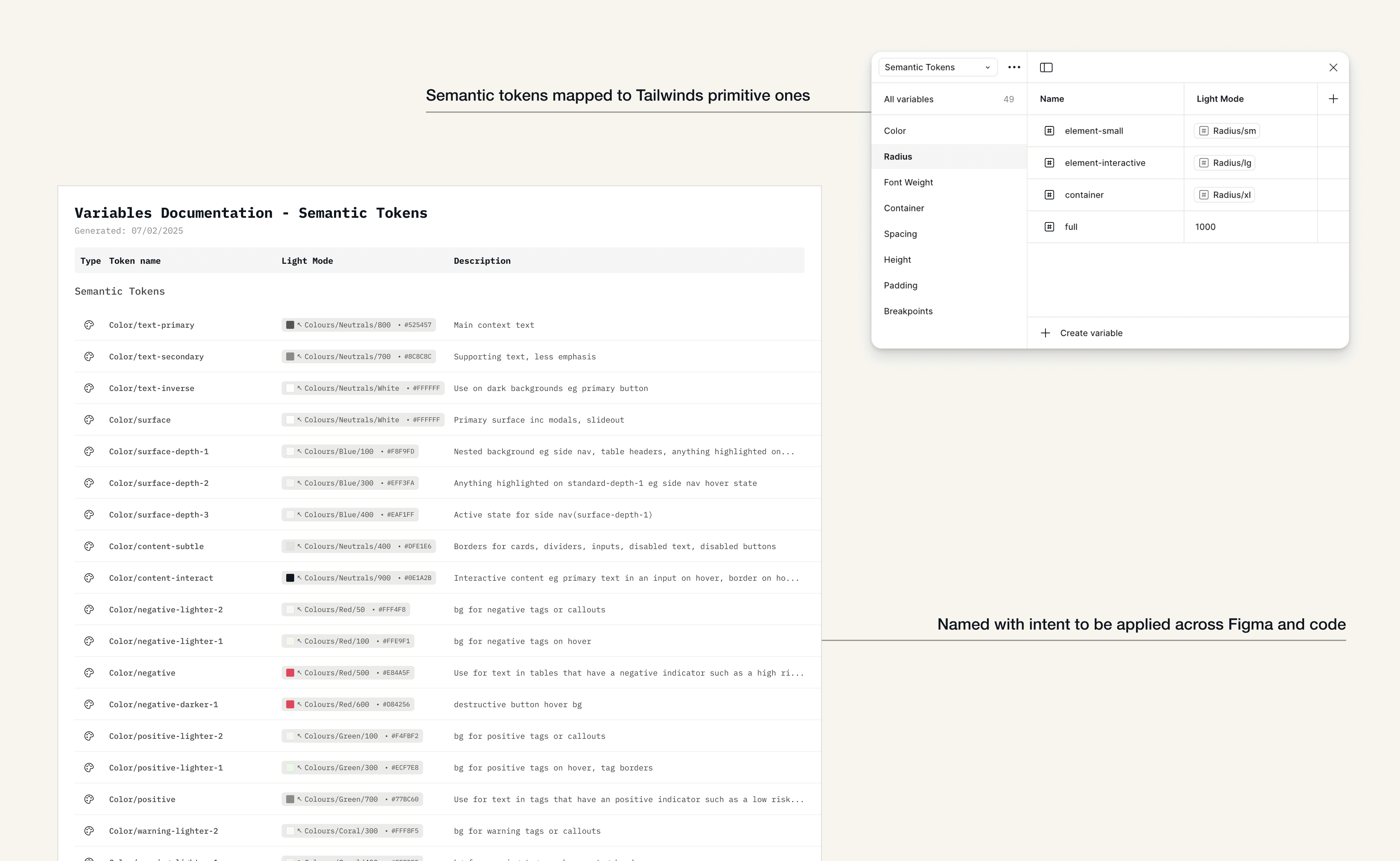
Semantic tokens labelled with intent
DOCUMENTING USAGE
For each component, I created accessible, developer-friendly pages that included:
Usage guidance and rationale
States and variants
Content and accessibility considerations
Token links for consistent styling
These weren’t just design specs, they were teaching tools, built to be referenced long after handoff.

clear guidelines to help devs build and use components easily
SPEEDING UP THE DESIGN PROCESS
By leveraging Figma variables and component instances, I made it easy to mock up new screens by simply swapping in structured elements; no rebuilding, no guesswork.
This depth of systemisation doesn’t just accelerate design today. It also future-proofs the team. As AI tools evolve, systems like this will become even more powerful, enabling us to feed our design language directly into tools like Figma Make or Lovable, generating prototypes that look and feel exactly like us.
speeding up design with comprehensive figma variables
Why This Worked
✅ Rooted in real team behaviour, not abstract design theory
✅ Light enough to feel flexible, structured enough to guide
✅ Integrated with how developers already worked
✅ Used intent-based naming so even without design involvement, devs could make good decisions
✅ Documentation could be updated as we learned and grew
Outcome
~15% reduction in time to ship new features
Visual and interaction consistency for users
Created a trusting, collaborative designer–developer rhythm
New team members could ramp up faster thanks to clean documentation
Reflection
Building this design system taught me that true design craft isn't just about beautiful interfaces; it's about creating the invisible infrastructure that enables teams to focus on what matters most: solving real human problems.
By establishing a foundation of consistency and trust, I allowed future designers and developers to channel their energy into meaningful innovation and our users to move with confidence, which is very important, especially in complex, high stakes environments.
Want to see the token structure or docs?
Happy to walk through them