Reducing Bounce Rate by 57% Through Intentional UX Fixes
After noticing a high bounce rate, I led an initiative involving UX, engineering, and CS to understand what was getting in users’ way at login. Through small, targeted changes I made sign-in feel simpler and more stable, leading to a 57% reduction in drop-offs.
The Challenge
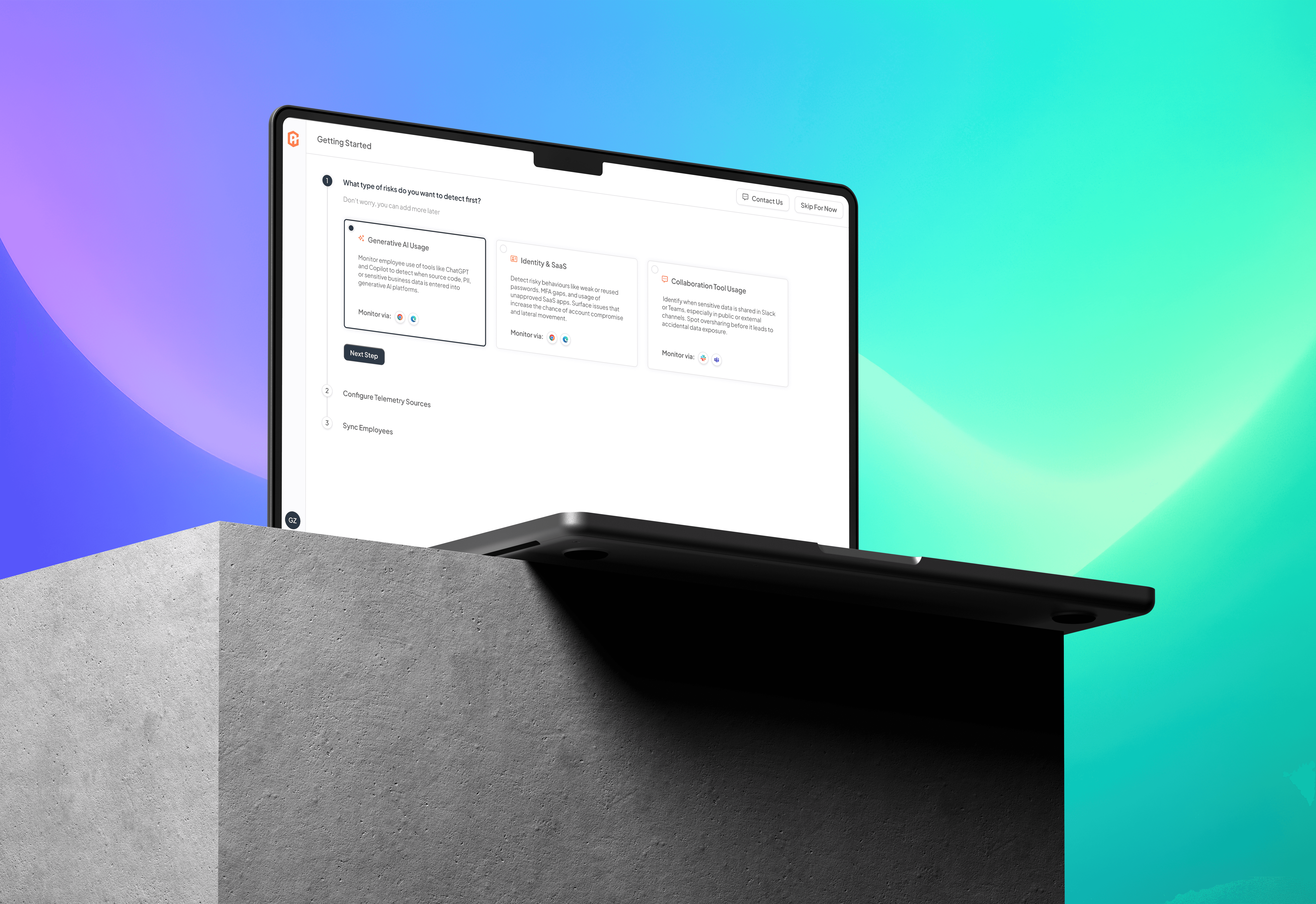
Over six months in 2024, CultureAI saw 15,000 logins, but nearly 70% of sessions ended before users reached the dashboard, and no one was even aware. This was clearly a really frustrating experience for a lot of first-time users and needed to change.
The Approach
INVESTIGATION
Through Hotjar recordings and user behaviour analysis, I surfaced three key friction points:
A confusing session timeout loop that left users stuck clicking without resolution
Slow SSO login, particularly on return visits
Permission errors that offered no explanation, leaving users unsure whether they should have access
By sharing real user footage with CS, we built shared visibility; revealing issues that had previously gone unrecognised.
leveraging ai tools to ideate and test quickly
IMPROVE AND REFINE
From here, I scoped out low-effort, high-impact changes that could increase clarity without requiring a complete overhaul:
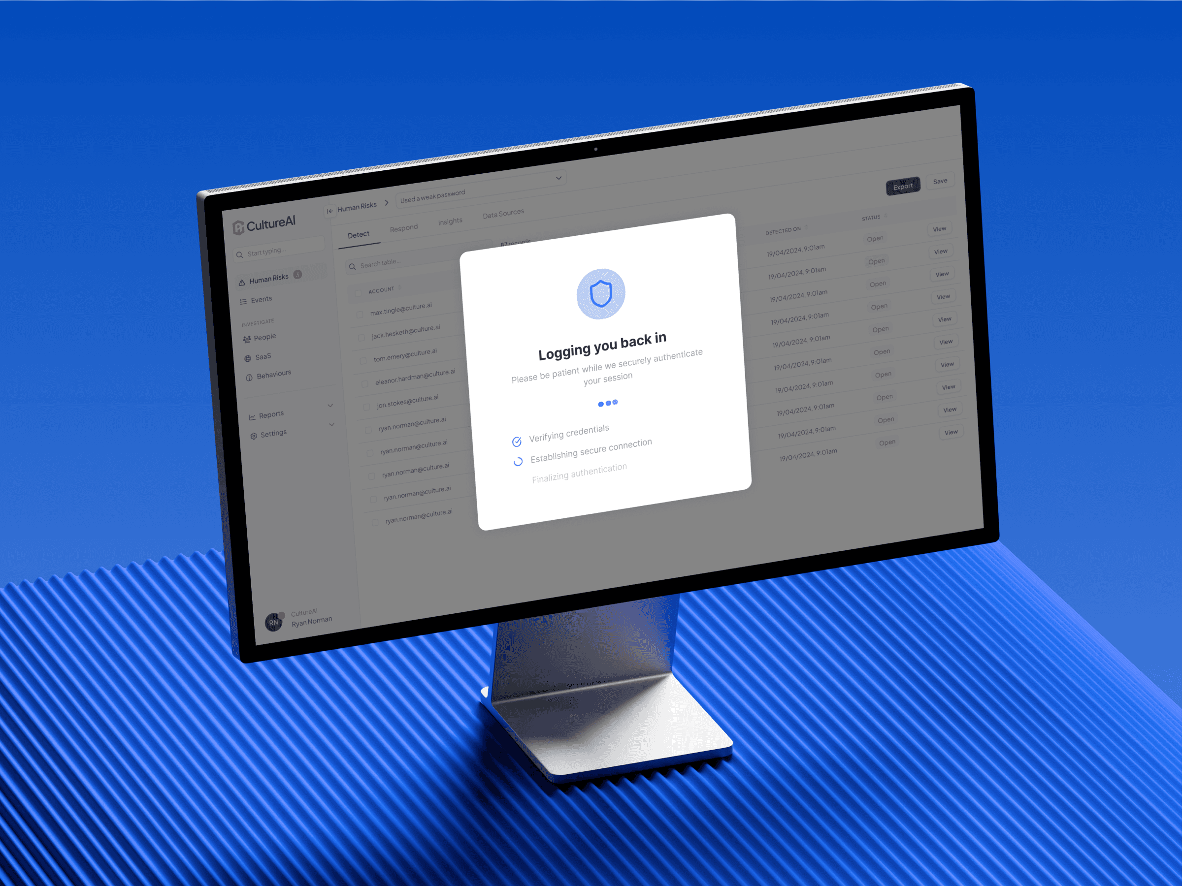
1. Clearer Session Reactivation
Replaced an ambiguous modal with a focused loading screen and message:
“Logging you back in — please wait.”
This small change dramatically reduced user anxiety and click fatigue.
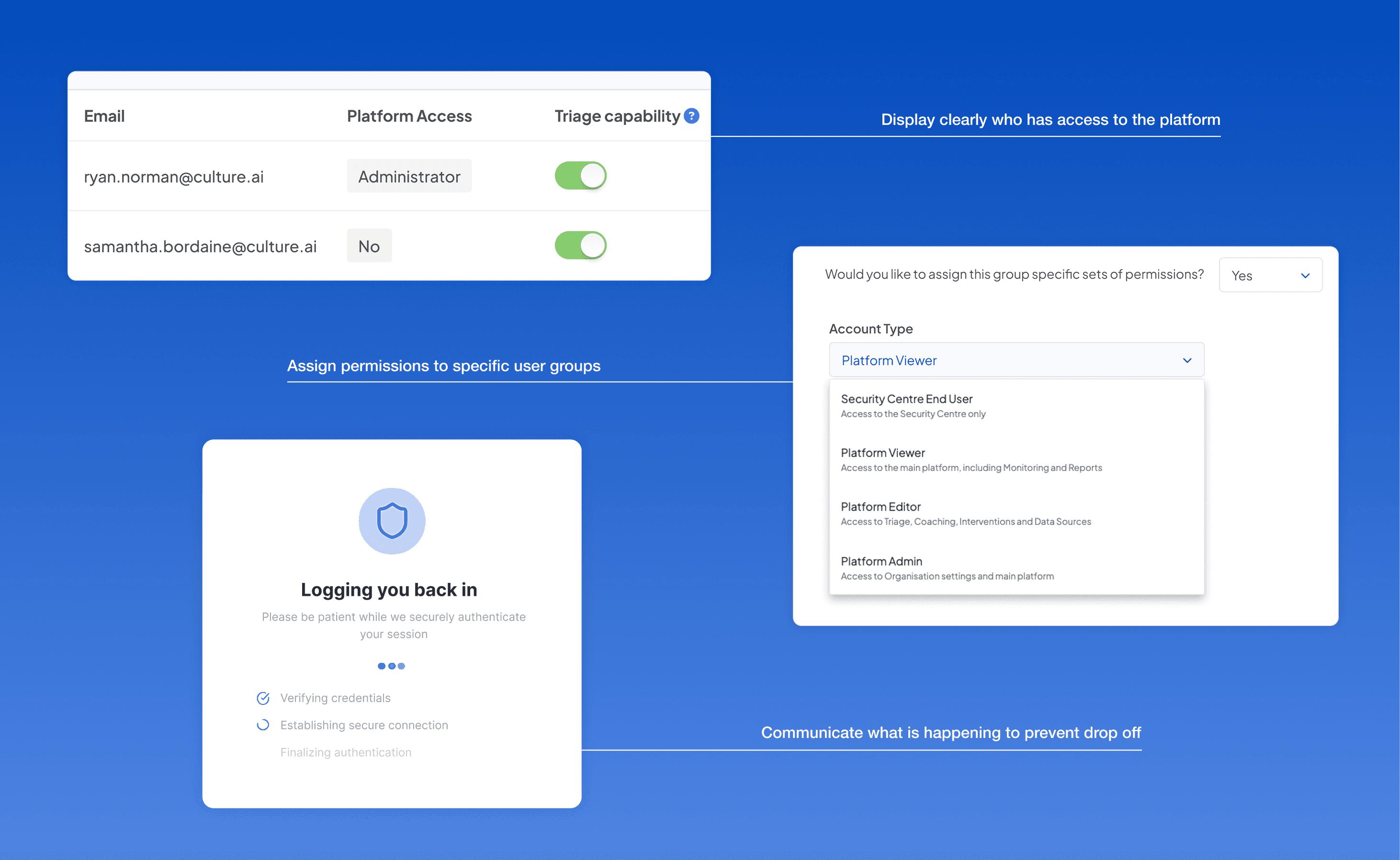
2. Improved Permission Visibility
Collaborated with engineering to surface permission logic in a more understandable way. Admins could now troubleshoot access issues directly, reducing CS intervention.
3. SSO Performance Fix
Escalated login latency with the backend team, resulting in a 23% speed improvement on return logins.
What didn't make it
Initially I wanted to introduce a “Keep me signed in for 8 hours” option (ideal for passive users or those leaving tabs open between sessions) but due to strict rules around keeping data secure, this had to be left out.
small ui updates that made everything so much simpler
PROTOTYPE AND TEST
I created a basic Figma prototype that was tested with the CS team and 4 clients. 3 out of 4 clients mentioned a drastic improvement and really enjoyed being involved in the design process. From here some improvements were made to the login modal to update it to what you see in the opening image.
session reactivation flow prototype in figma
The Outcome
Bounce rate dropped from 66.8% to 9.2% (A 57% improvement!)
Users were left much less frustrated
Improved access clarity for admins and reduced burden on CS Team
POV sessions became smoother, with better engagement from the start
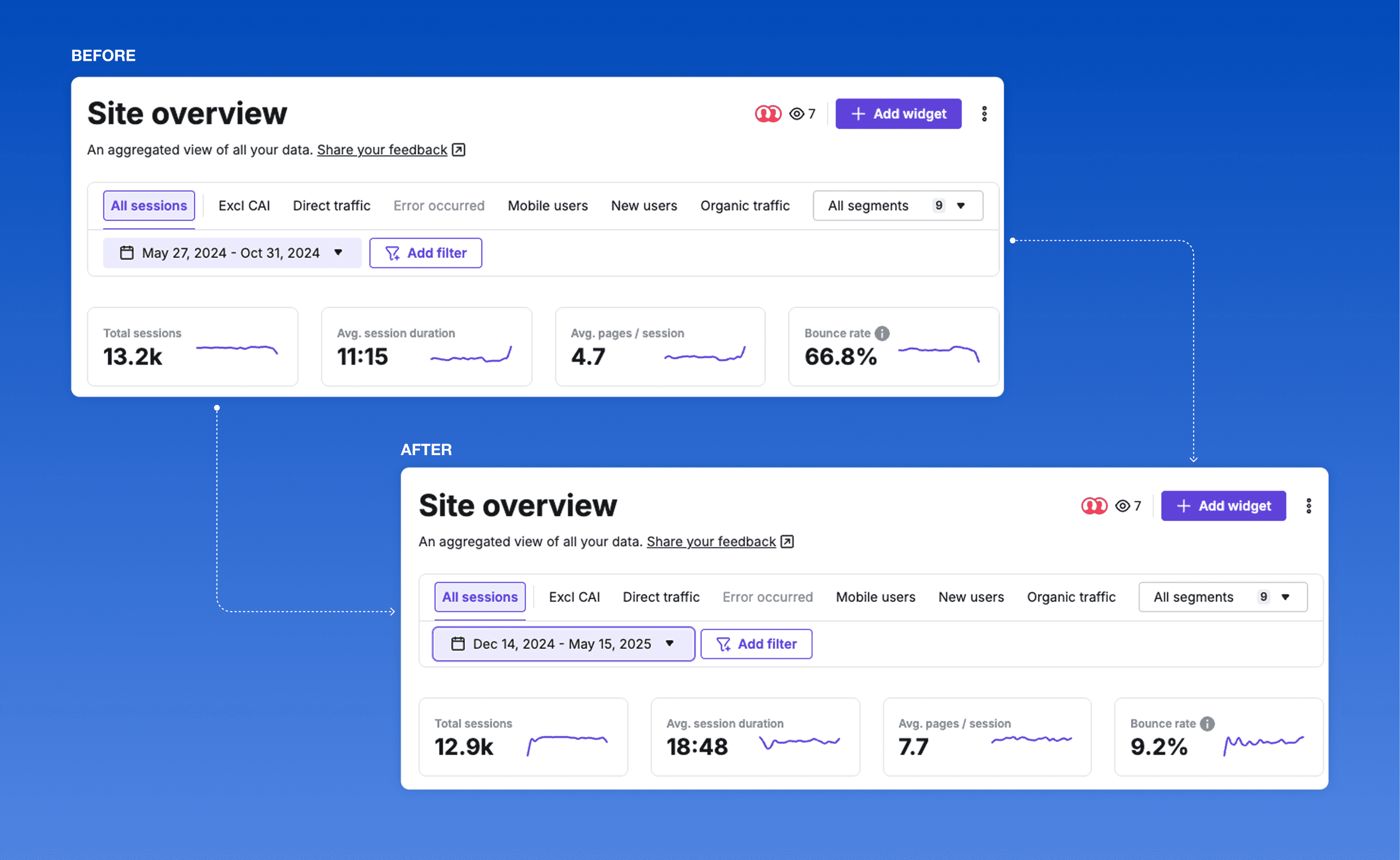
Huge improvement in bounce rate from before and after going live
Reflection
Even the simplest surfaces, like a login flow, carry emotional weight. They signal trust, momentum, and invitation.
This work reminded me that product experience begins before the interface loads. Thoughtful micro-interactions, paired with cross-team alignment, can quietly transform the way users feel when they arrive.
Want to learn more about the process?
Happy to show you around.