Onboarding Redesign That Boosted Conversions By 13%
Through collaboration with engineers, GTM and product teams, I redesigned CultureAI's onboarding experience to better support technical users during trials. By guiding them through a simple, use-case-led flow, I reduced overwhelm and helped the product prove its value faster; leading to a 3.2x increase in trial conversions.
The Challenge
CultureAI's existing onboarding flow was confusing, daunting and unintuitive. Unsurprisingly, just 6% of trials converted.
My goal was to rethink this first-touch experience both visually, and strategically; to reduce friction, surface immediate value, and create a setup flow that built trust.
The Approach
RESEARCH
Through user interviews and internal alignment, I clarified that the onboarding was usually completed by a technical stakeholder (e.g. an IT Technician), who:
Would configure things once, likely in a single sitting
Needed clear guidance and fast time-to-value
Didn’t want to click around a confusing UI or open multiple tabs
This insight helped a lot: I wasn't designing for engagement over time, but for clarity, speed, and confidence in a single, high-stakes moment.
I also ran a UX Audit on the current onboarding experience and benchmarked tools like Snyk, noting how they de-risked decisions through smart defaults and guidance.
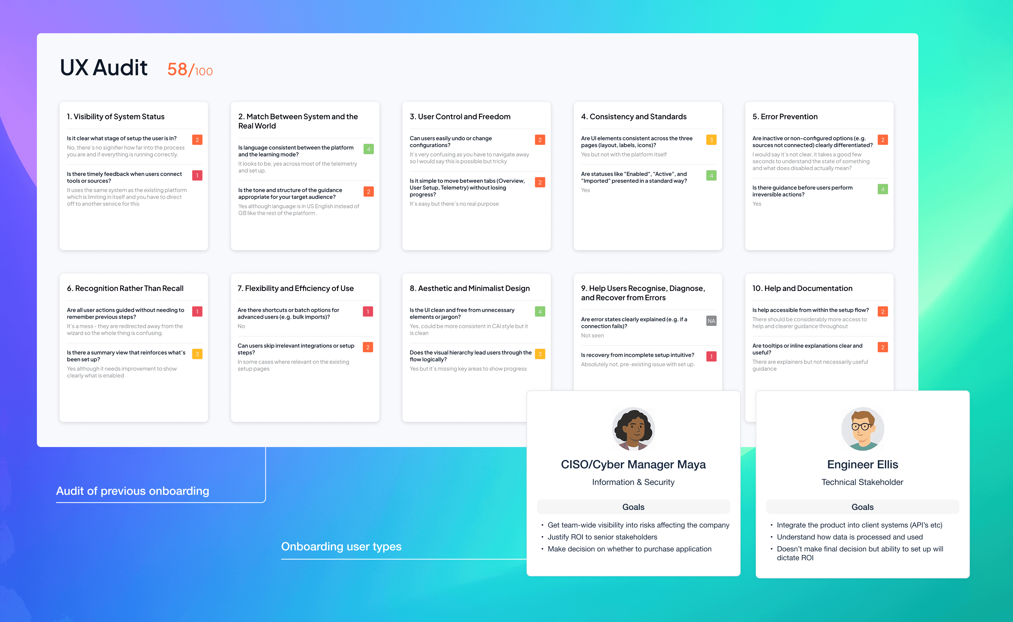
UX Audit of existing flow showed a poor experience
EXPLORATION & PROTOTYPING
Armed with a clear understanding of the problem, I created two divergent flows:
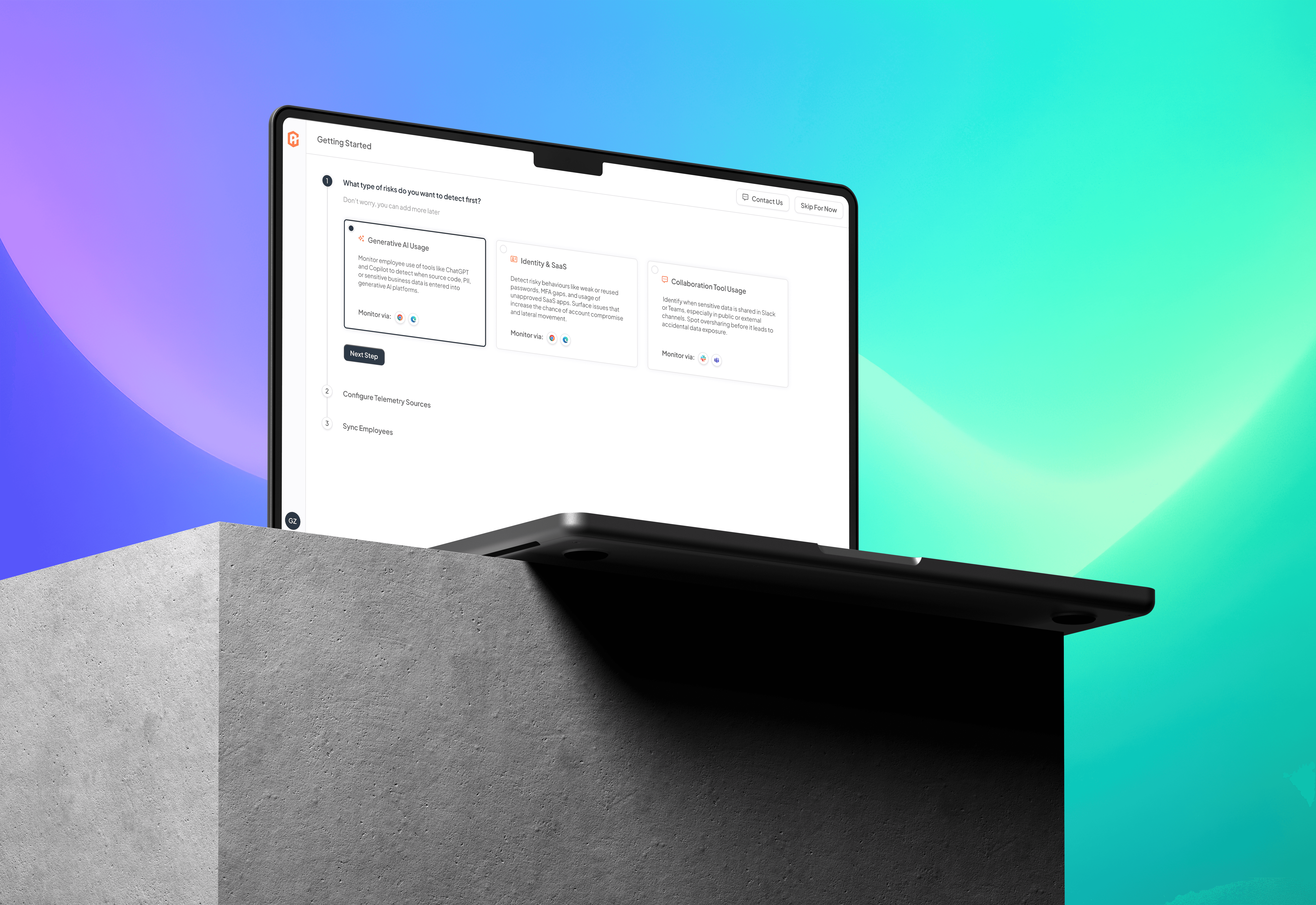
Option 1: Use-Case Onboarding
Walkthrough experience tailored to 3 high-impact use cases
User only needed to set up 1 data source and sync users to unlock value
Guided flow, fast time to insight, low friction
Option 2: Dashboard Drop-In
User lands in empty dashboard, must find and configure tools manually
Familiar pattern, but disorienting and hard to measure success
I recommended Option 1: the flow was more intuitive, goal-oriented, and aligned with marketing’s narrative. The CMO supported this fully. The CEO was initially hesitant (“why not include all data sources?”), but I used research insights to show that less is more in first-touch moments.
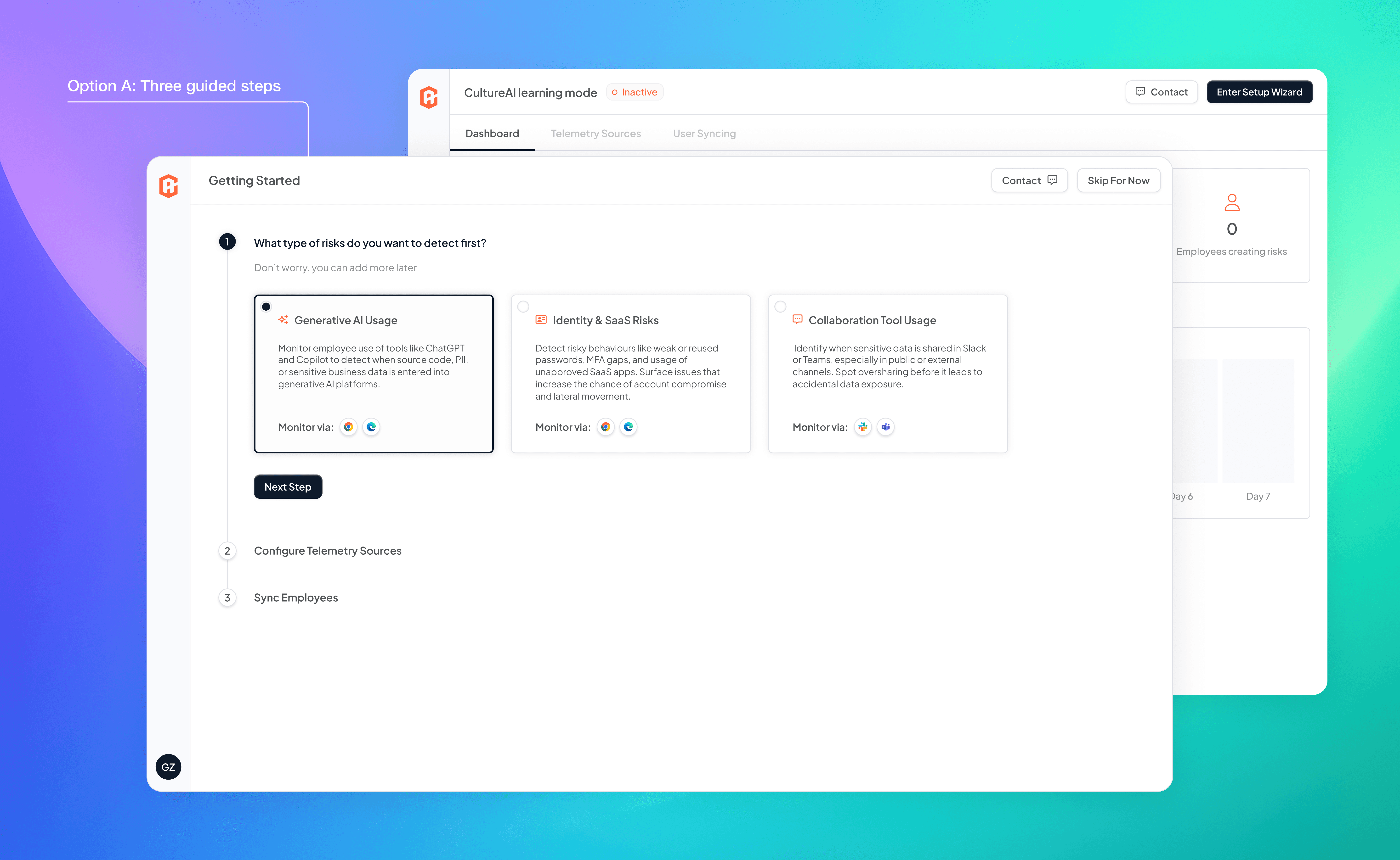
reduce cognitive load with only 3 options
CROSS-FUNCTIONAL ALIGNMENT
I developed a working prototype in Figma using our design system and generated a live walkthrough using Lovable to:
Get buy-in from execs and devs
Speed up feedback loops
Align teams before committing to build
I ran refinement sessions with engineers, the PM, and leadership. This helped uncover technical edge cases (e.g., Chrome could be deployed in three different ways) and ensured we could scope it effectively into a 3-week dev sprint.
leveraging ai tools to ideate and test quickly
ITERATION & MICRO DECISIONS
I tested the prototype with internal teams and a few friendly clients. Some key friction points emerged: users often clicked a card accidentally, then wanted to go back. I reintroduced a “Next step” button for deliberate progression.
To streamline things further, I pre-selected the default card to reduce perceived load time and cognitive effort.
I also worked closely with engineering to define load expectations, transitions, and responsive behaviour. For best experience load times should be below 3s, but the timeframe wouldn't allow this, a trade-off was made to ensure that 90% were below 3s as long as guidance was followed when they were over.

crafting the details to ensure the best experience
NAVIGATING CHALLENGES
Mid-build, the CEO requested support for multiple risks selected at once. Based on prior alignment with the GTM and PM teams, I confidently pushed back, explaining how a single risk-first approach was more effective. It gave the user a small win fast, then delighted them by letting them turn on more in the success step. We retained simplicity without sacrificing value.
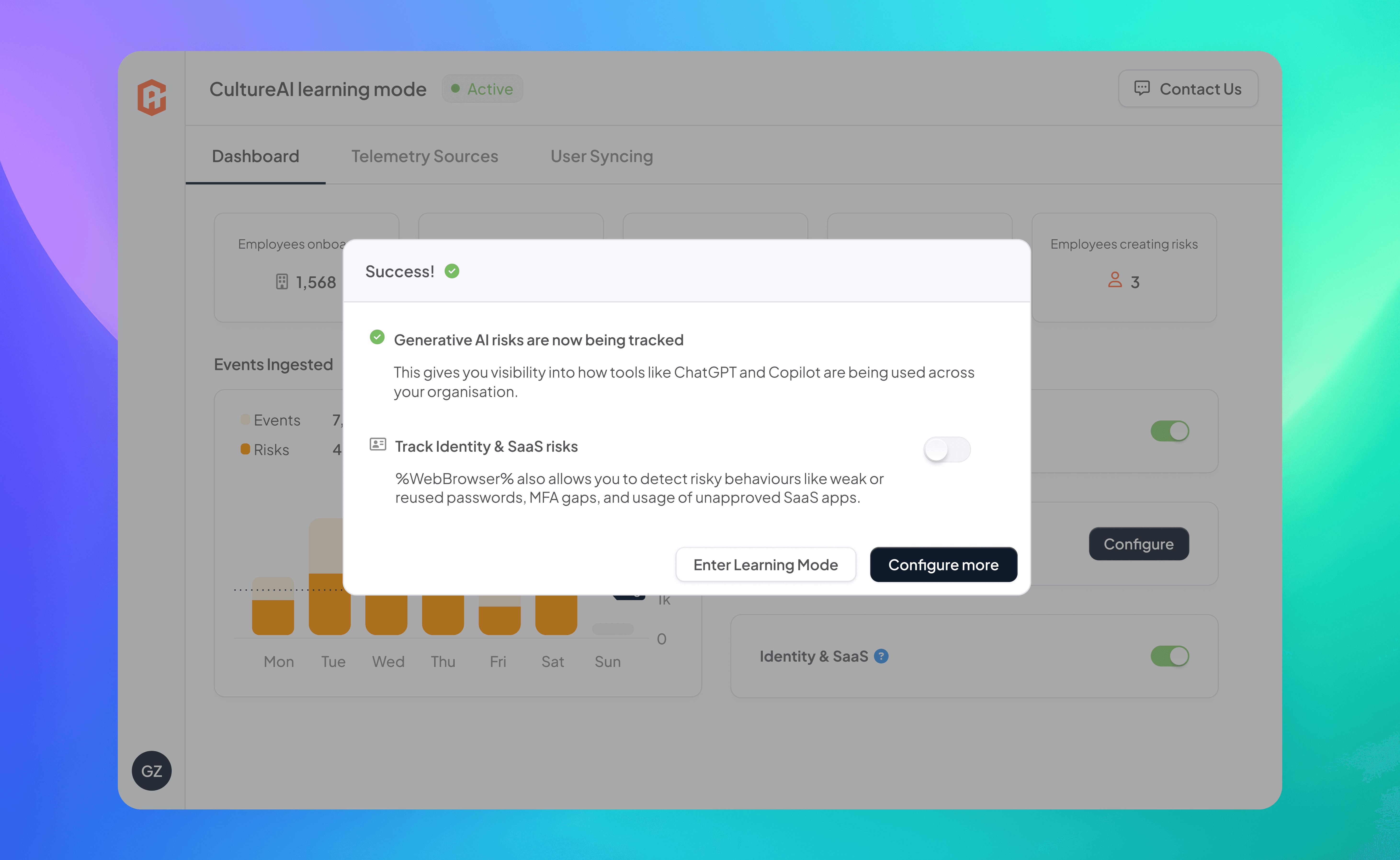
bonus functionality at the switch of a toggle
Why This Design Worked
Less overwhelming: Reduced options from 25+ to a handful of high-impact defaults
Clarity: Every permission or config step included contextual tooltips to build trust (“Why do we need this?” etc.)
Aligned: Created a repeatable story that was easy for Sales and Marketing to use
Targeted the right users: Gave decision makers instant gratification through synced data and visible risks
Outcome
Before: 6% conversion
After: 19% conversion (9 signed contracts from 48 trials)
More importantly, the product’s first impression now reflected its actual value; making it easier for people to get started, gain confidence, and see results. Internally, the experience also became easier to demo.
Reflection
This project wasn’t about just simplifying a screen; it was about designing an onboarding narrative that respected technical users, told a clear story, and balanced business, engineering, and UX needs under real constraints.
It reminded me that first impressions are often the most strategic surface in the product and that small interface details can have big trust impacts, especially in complex domains like cybersecurity.
"When you remove friction, offer clarity, and respect your users’ time, conversion naturally follows."
Want to learn more about the process?
Happy to show you around